Brand identity / Travel & concierge
Beyroute
A sense of possibility.
An identity made for the journey.
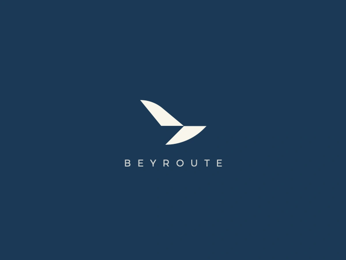
The idea takes flight.
Beyroute is a premium concierge and travel brand. Its identity brings three ideas into one mark: the freedom of a bird, the letter “b,” and the direction of an airplane.
- Client
- Beyroute
- Discipline
- Brand identity
- Design
- Qalamhasan
- Scope
- Logo, visual system & applications
Video unavailable. Open the video directly.
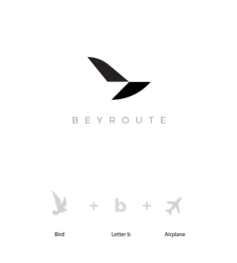
Three references. One distinct silhouette.
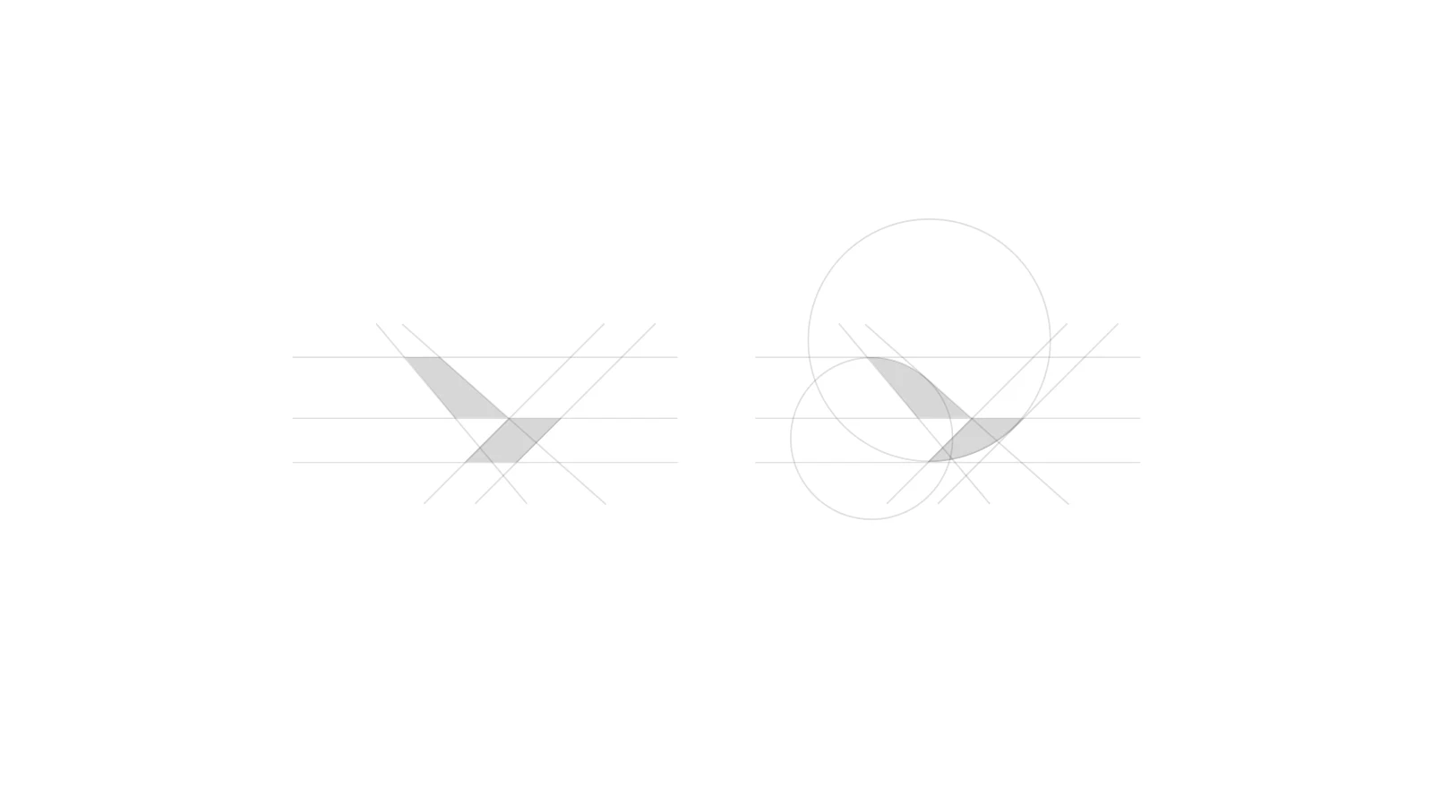
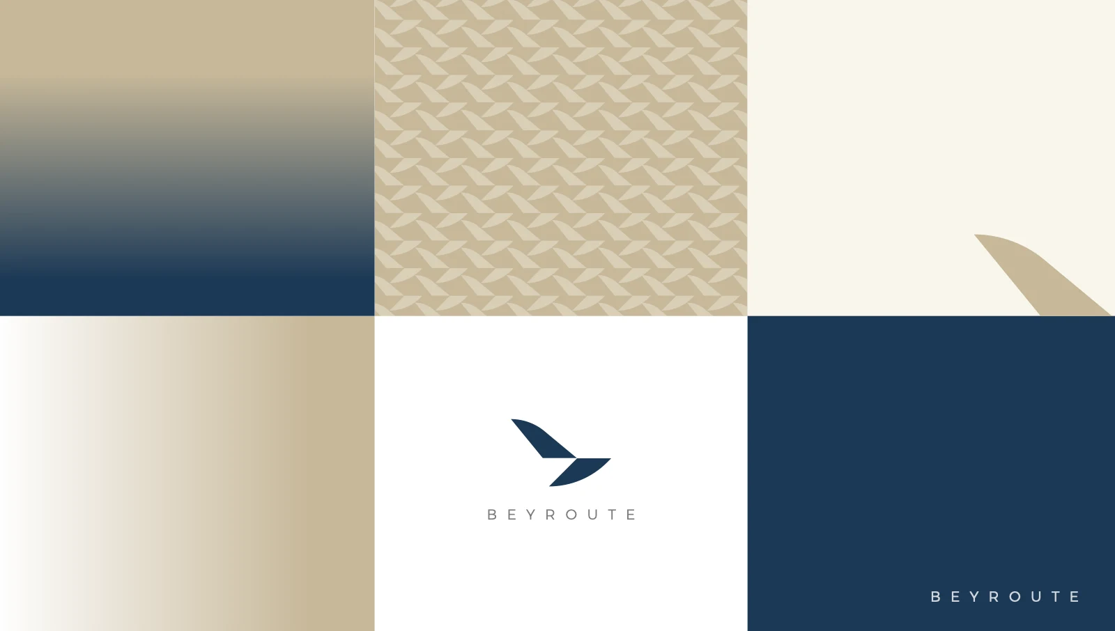
A considered visual language.
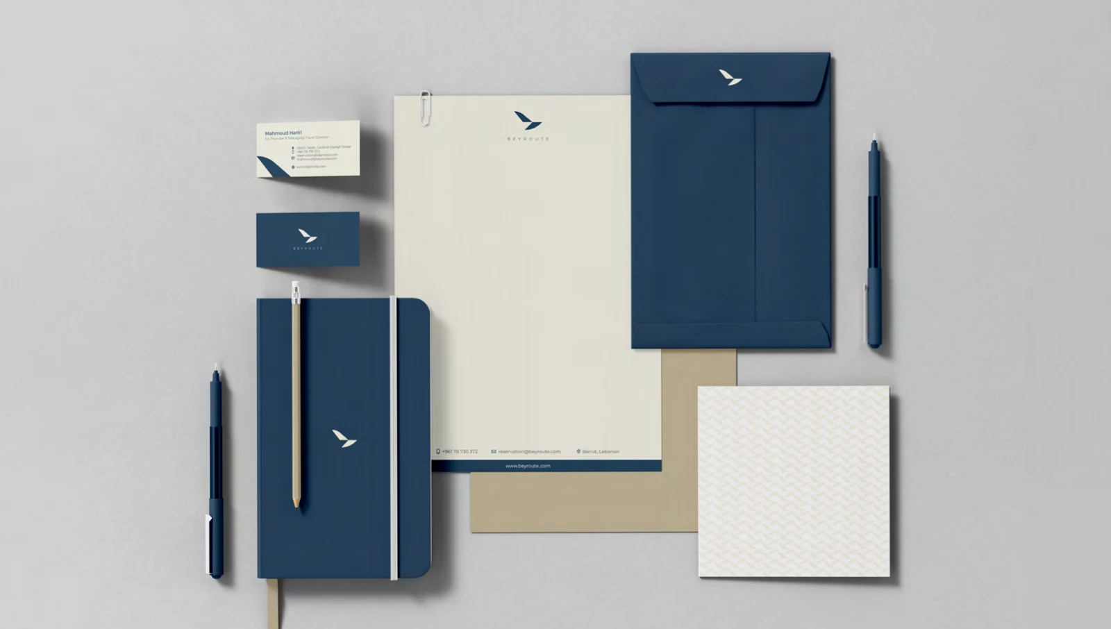
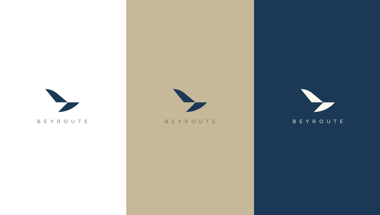
Deep navy, sand and light neutrals give the identity a calm presence. A flexible wordmark, repeatable patterns and clear typography carry it across formats.
Video unavailable. Open the video directly.
Video unavailable. Open the video directly.
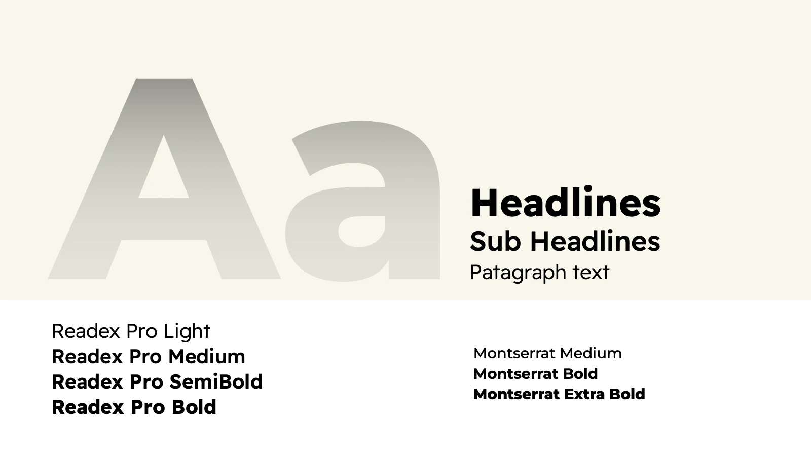
Type with room to breathe.
Montserrat and Readex Pro bring a clear hierarchy to the brand presentation, from expressive headlines to everyday information.
Out into the world.
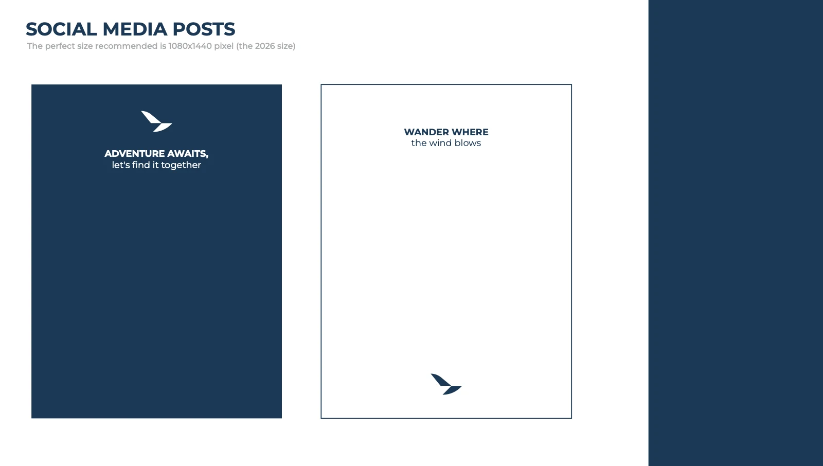
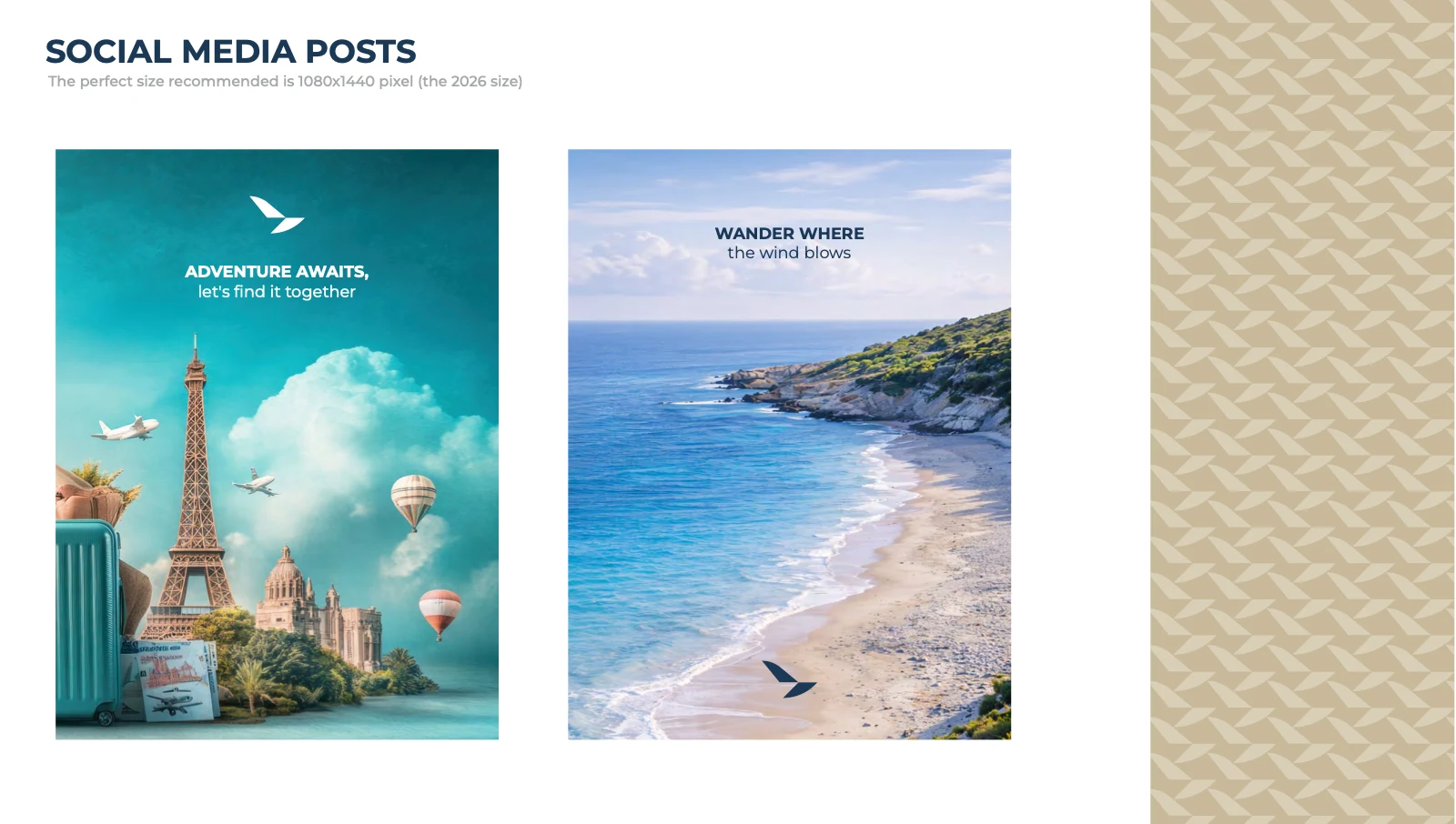
The identity travels from printed brochures to airport advertising and hotel details. Each touchpoint carries the same visual language.
Video unavailable. Open the video directly.
Video unavailable. Open the video directly.
Video unavailable. Open the video directly.
Video unavailable. Open the video directly.
Made to be recognized.